Welcome to Wangjianshuo’s Blog

Hi all, welcome to Wangjianshuo’s blog. I am Wang Jian Shuo. I live in Shanghai. I want to be visitor’s personal guide to this amazing city.

I try to help people to live better in Shanghai. You can get information about finding a job, making phone calls, getting Internet Access, using credit card , taking taxis. I will show you places to eat, to see, to shop, or to buy :-).

For visitors, I write about Pudong Airport, how to transit to other places, via Maglev, metro, buses, or train.

I introduced some hotels to stay, featuring some cheap and good hotels.

I have an online Shanghai Map, and accumulated three year of first hand observation of the weather in this city.

I love the city of Shanghai. I took photos to record its changes, and am worry about problems like traffic, or polution

I travelled to many places. I like to visit beautiful places (like Daocheng, Lijiang, Sanya, Xiamen), and frequently visit cities like Beijing, Guangzhou, Chengdu and Hongkong. At weekends, I often go to places near Shanghai. In particular, Hangzhou, Chongming, Taihu, Yangshan, Shengsi.

Going abroad, I visited Seattle, and San Francisco for many times, and went to New York and other east coast cities for once. On the way there, I ever stayed in Japan for 5 hours. I hope to complete a Visit U.S. Handbook. The only thing I don’t like for travel by air is, jetlag.

A little bit about myself.

I was born in Luoyang, and went to Shanghai Jiao Tong University. Then I worked in Microsoft for almost 6 years, then joined Kijiji in March, 2005.

I like sports, such as running, and cycling. I am dreaming of having a boat.

Two years ago, I learnt to drive, and bought a car. (I call it Goudaner). Then I moved from Puxi to a apartment with garden in Pudong. Some cats lives in it.

This blog was started more than three years ago. I chose to use English to benefit international visitors. It is now reported by many media. I use MovableType as blogging tool, and shared the tips and the back stage to build this website. I was forced to change my hosting company many times though.

Recently, I reviewed companies in emerging technology field, attended many conferences, and start to study the culture of both China and western countries, and see the conflicts when the west meets the east.

In my life, I also do crazy things. I joined the confluence project to visit integer cross point of latitude and longitude, and host meetup everywhere. I even visited all Starbucks by walk, and set up an personal photography exhibition in April, 2004.

I enjoy books, movies, and trying to understand art and improve my productivity. I think deep about what life means, how happiness works, and how I can help others. I am proudly a consultant for Smiling Library.

I am so happy to have Wendy as my wife, to have lots of smart friends, and thousands of readers. You can see my collection of funny toys. At this blog, I also celebrate all holidays, and special days with good wishes. For me, every single day is a holiday.

Thank you for staying with me.

Search This Site

Tip: Directly type and hit "Enter" on any page to start search

First Contributor of New MyBusStop Project

Joe became the first contributor to the newly opened My City, My Bus Stop project. Here is the stops/lines he just contributed:

JiaLiFang

QingFangShiChang

GJ743

The editing history can be found from the Page History link (example).

Thanks Joe for being the first and the nice description of JiaLiFang .

Following his link on JiaLiFang, I found his interesting blog. Joe seems to be in the same field as Isaac and Zheng. They are all of the style I like – the style of a very passionate learner and a sereious thinker. Joe brought a very good start to the new project. I am going to publish the source of the Wiki so the files can be backed up in many different locations and does not waste people’s effort if the server crashes. I do keep my weekly backup. The old entries contributed by Billy Qiu, Xiao Gao and others’ have been restored to the current base. I believe the baseline of any public service that others can contribute is there is no data lose at any time.

MyBusStop Project Reloaded

“Winners never quit and quitters never win”. This is what I learnt from two years of blogging. I started some interesting ideas, but it stopped for some reason. Many people have brilliant ideas but not many can stick to with them.

I started the My City, My Bus Stop project in the first week of 2004, but the system failed because of migration to the new server. It involves much work to rebuild the whole thing and it did take some time to rebuild it. My friend Isaac has asked about the status of the project and so have some contributors. Although it took about half a year to fix it, I finally fixed the problem and now everything works. I bet we can start it again – the My City, My Bus Stop Project hasn’t die yet. (These two paragraphs were rewritten according to mc_dean’s suggestion)

Go to My City, My Bus Stop Project (Chinese site)

screen-my.bus.stop-lines.GIF

screen-my.bus.stop-stop.gif

The Base

The project started with a base of all public transportation lines in a Wiki site. Now there are nearly 400 lines in it already. You can navigate through public transportation lines or see which lines stop at a certain stop. It is very useful for people to find the right bus in the city.

At least, I believe it will become one of the top results for many bus stop names in Google within two months, as the Shanghai Map did. Why? Google loves the intensive cross links in the Wiki site.

What is the Next Step

The power of the Wiki site is that everyone can modify and contribute to the pages. Here is how everyone can participate.

Attach Your Blog to a Bus Stop

If you run a blog, you can put your blog along with your name to the stop that is nearest to you. No matter where you live in the city, there must be a stop that is closest to you. For example, I put my name at TianChi. Maybe you can find a blogger at the same bus stop. It will be fun if you find other bloggers this way.

Describe the Stop

The initial idea behind this project is, by describe the points of the city; we have some idea of the whole city. If you are interested, you can select a bus stop, and describe the bus stop in your own words. You can tell people what is unique in this bus stop that makes it so special within the city.

Correct Errors and Update the Route

There may be errors in the map and you can correct it. There are new bus lines, such as GJ607, that can be added into the system. So help yourself to do it.

How to Participate

If you want to participate in this project, follow the simple steps:

1. Choose a stop. You can follow a bus line to reach your stop.

2. Click “Edit Page” button located on the top-right and/or bottom of the page.

3. Modify the page as you wish. You can find formatting tips at the end of the edit page.

4. Click “Save” to make your change available for others. Yes. No authentication and authorization are implemented so far. This is how Wiki works.

Good luck! This is Your City.

First Contributor for MyBusStop

Bill Qiu is the first person to take a picture of a bus stop in the My City, My Bus Stop Project. He took a picture of LuoYangErCun

screen-Luo.yang.er.cun-703B.jpg

Image courtesy of Billy Qiu, Wangjianshuo’s MyBusStop Project

Well done. The system still need to be built – the idea itself is not good enough to support the community effort – if the geek Billy cannot find out good way to add a new route of 703B, I guess no one in the world can do it. So Wiki is not the final solution, at least now, when the idea of Wiki is not popular. Yes. You can directly click the link on the bottom left corner of a page to modify any page.

If it is the first time for your to experience Wiki, you will be shocked after you click the Save button. I was when I first edited a Wiki site — my eyes opened big and my mouth also opened widely to see my modification is REALLY saved. Hehe.

Went Skiiing

I went skiing with Daisy, Alex and Xia yesterday. It was quite long before we got together. We went to McDonald at Xinzhuang Metro Station. The McDonald hot soup looks good. I took a picture. But the Big Mac is really jerk.

shanghai.ski-mcdonald-soup.jpg

© Jian Shuo Wang

Looks better

Compared to the same site in October, 2002, it looks better. The blue back drop on both side decorated the site very well and the higher area’s construction is complete. So it is a full featured site already.

Looking above from lowest field. The run way is divided into three areas. The lowest, at an angle of aboug 15° is for juniors. The middle is about 20° and the highest part is almost 30 °, I guess.

shanghai.ski- full.view-bottom.up.jpg

© Jian Shuo Wang

People learning skiing.

shanghai.ski- skiing.site-left.jpg

© Jian Shuo Wang

shanghai.ski- sticks.jpg

© Jian Shuo Wang

shanghai.ski-clothes.jpg

© Jian Shuo Wang

It is super cool to rush down from the second field down to the end of the run way. Haha. The ticket price turned out to be 138 RMB for two hours and 98 RMB for one hour. The site closes at around 10:30. The 125 RMB for unlimited time option is only avialable on Friday and Saturday after 7:30 PM…..

My City, My Bus Stop Project

I started the My City, My Bus Stop project last weekend. It is inspired by the Degree Confluence Project – a project aiming to visit and take picture of each of the latitude and longitude integer degree intersections in the world. I am thinking of a project to visit all the bus stops in Shanghai, take a picture and write simple description about it. The temporiy home page is hosted here.

You may have noticed that I put a small icon screen-i.am.here-logo.png on my home page. It links to the nearest bus stop of where I live.

I believe it is a great idea if many people (especially bloggers) join in to take pictures of the bus stop and add themselves to the database. They will form local communities around each bus stop…

The system is currently hosted on Wiki engine. It is a good way for online collaboration. Any one, yes, anyone who can see the page, can edit the page and add their own comment on the page. That is the power of Wiki.

World Airport Website Report – Terminal Map

As the third part of Word Airport Website Report, it will cover the terminal map and airport information section. As always, I will choose some typical websites and analysis how well they deliver the information to airport travellers.

SFO – San Francisco Airport

This is the oview terminal map for SFO.

screen-sfo.airport-terminal.map.gif

It will be better if they have the introduction for this map. My questions are like:

1) What is the relationship between Terminal 1 and Terminal 3? I am flying with UA and which terminal should I likely to arrive?

2) Why only three terminals were named. Why the outlet of Gate 40-48 is not called a terminal?

3) What is the area marked with A/B, B, C, D, E, F, F/G? (They are boarding areas)

Services, Shops, Arlines…

The services, shop and airline information on SFO is more like an application instead of a website. By choosing the category, you are offered a list of items so you can get more inforamtion about the item. It is amazing that it covers almost all the facilities on the airport.

For example, here is the list of the services:

Services

=============================================

Information

Airport Information Booths

Customs Information

Travelers Aid

Services

ATMs

Banking Services

Cellular Phone Rentals

Currency Exchange

Hair Salon and Public Showers

Lockers & Storage Facilities

Lodging, Transportation & Attractions Board

Lost & Found

Luggage Carts

Medical Clinic

Nurseries

Postal Services

Shoe Shines

TDD Telephone

Telephones Equipped with Dataports

Travel Agency

Wheelchairs

Take the ATM as an example, it provide detailed information about each ATM on the airport.

ATMs

Bank of America ATMs are located in

Terminal 1: Boarding Area B

Terminal 3: Boarding Area F

Union Bank ATMs are located in

Terminal 1: Rotunda A, Boarding Areas B and C.

Terminal 3: Boarding Areas E and F

Wells Fargo ATMs are located in

Terminal 1: Boarding Areas B and C

Terminal 3: Boarding Area F.

Travelex ATMs are located throughout the International Terminal

The only see I can see to improve is to put the map along with all the introductions so it is easier to locate then on the map.

Gates

In SFO, certain airlines are serving predefined gates. That makes it easier locate a gate or an airline. Here is an example. It looks nice:

Gates G91-G102

Boarding Area G

Gates G91 ?G102 are located in International Terminal Boarding Area G. The following airlines service these gates:

Aeroflot

Air China

ANA – All Nippon Airways

Asiana

EVA Airways

Lufthansa

Mexicana

Singapore Airlines

United Airlines (international)

Overal Rating

The Airport Guide section of SFO provide enough information for customers. The only shortcoming from my perspective is, the application nature (or the Framed nature) of the guide are not search engine friend and the fragment of information may not be as effecient as putting everything together on the same page.

Atlanta Hartsfield Airport

The concourse layout map at Hartsfield Airport seems to cost a lot of effort to built.

Till now, I still think the SFO’s version is better – a frame work to provide clear gate information and the lane inside the concourse, then provide the location marks on the seperate map – putting everything together on the same map is not easy to read.

Conclusion

Based on my obversation, to be a successful terminal map,

1) The map should use clear fonts and icons – too small icons make it useless.

2) The map should be careful to use icons – sometimes it will be better to mark only neccessary icons.

3) The map should avoid interactive content – Denver’s interactive concourse map does not show the content at once.

DFW – Dallas Airport

Dallas Airport provides a very good idea to put a terminal map on the top and a table of facilities at the bottom.

The facility can be easily found if the gate number is given. I believe the future PVG.CN will take this approach – easier to create, update and read with less effort, compared to a large map with all the legend and icons on it.

JFK – New York Airport

The JFK Terminal Map is the typical all in one map with all different kinds of icons fillup in the same map. I don’t like this kind of map.

World Airport Website Report – To & From Airport

This is the second part of my World Airport Website Report. The topic of this article is To & From Airport.

SFO – San Francisco Airport

Driving Direction

The driving directions is not directly located in the SFO airport website homepage. The only link to the page is the SFO Terminal Map under Airport Information section. It confuses with Airport Guide link on the top navigation – as I stated before, the vertical navigation structure is often ignored by users. Do you also agree?

Location

OK. For the driving direction page, what I expect is a location map. For SFO page, it is not that good, but it provide a description of the location:

San Francisco International Airport is located approximately 13 miles south of San Francisco, near the junction of Highways 101 and 380.

That is also good.

Route

The driving direction under From 380, From the North, From the South are concise and clear. I especially love the direction map:

Above: The scale and detail level is just enough to illustrate the direction.

Train

Besides driving directions, train is also the must-have information for an airport. The AirTrain information provided by SFO is very nice and detailed. The only problem is in the daul navigation system. I mean when I navigate to AirTrain page from the left navigation bar, the vertical navigation bar on the top also appeared. This kind of arrange is confusing. I need to avoid it in my design for PVG.CN

screen-sfo.airport-airtrain.PNG

The map, I have to say, is too small and does not illustrate the stations clearly. If it can be 50% larger, and provide more information about for the stations, it will be perfect.

The FAQ section is very good. It provide answers to questions like “Can I take my bicycle on AirTrain?” – very well done.

Phone numbers

The phone numbers of SFO page must be useful. For Shanghai Pudong Airport, maybe I need to provide a phone number of my volunteers at schools instead of the airport phones – they don’t speak English. Mostover, the phone numbers published are either busy all the time or no answer.

Taxi

There is a ground transportation section on the top navigation bar. Taxi, vans, buses and other ground transportation are listed at the left navigation bar. It is a pitty that there is no route for all the services.

Overall rating

4.5 out of 5. The 0.5 point is for the navigation structure.

SIN – Singapore Changi Airport

Navigation

Transport section on Changi Airport is not easy to found. It is listed under the Arrival part which is not reasonable. To & From Airport is still a very good title for this kind of information.

Ground transportation

The information provided by Changi Airport is concise and to the point. They are broken into the following sections:

Overview

Travel Fare/Destination (From Airport to City)

Frequency/Contact Information

I believe they are the most interested information for any type of the transportation. The pictures of the taxi/bus should be very useful and the map of the route should also be provided. I didn’t this this on their website.

Over Rate

4 out of 5.

NRT – Tokyo Narita Airport

Here is what NRT call the same “To & From Airport” information:

Ground Transportation – getting to and from Narita Airport

Under this title, taxi, bus, rail options are given.

Location of Airport

For the Location of Airport page, it is among the best to provide visitor some sense about where the airport is. Most of the airport, including SIN and HKG, didn’t provide the information.

If it can be improved, they should mark where the island is at the whole Japan country. I believe many people, including me, don’t know exactly where Tokyo is within Japan. Some may even don’t know about where Japan is exactly located in Asia.

Train

Train information at NRT is compresensive. But the problem is, it is not concise and I didn’t get the point after first read about the page – what do you feel?

The problem maybe, there is no short overview like that found in SIN airport website. Moreover, there are too many lines – in thick blue and red lines and didn’t give people an idea about which line they should take.

Buses

Like train page, the buses page is the traditional Japanese style – intensive use of tables, names but may not be use friendly if people don’t know about the name of the cities.

To & From Haneda Airport

This section is unique in NRT airport since Tokyo has two airport. I didn’t know that before I read the page.

There should be a brief introduction explaining the facts of two airport, their relationship and why people need to go between the two airport.

Connecting between Terminals

Well. As tradition, this section should be placed into the Terminal map section. Besides the good map, they need to provide more information (just overview) about the difference and the relationship between the two terminals. Otherwise, I don’t see any reason I need to transit from one terminal to another.

DFW – Dallas Airport

Navigation

The DFW’s web designer put the airport transportation into the wrong location – at least from my perspective – they put it under Airport Guide, along with Terminal and Parking information. See screen shot below:

screen-dfw.homepage-transportation.PNG

Look at the first level navigation bar:

Home

Flight Information

Airport Guides

Shops & Restaurants

Travel Planner

About DFW

MediaSite

Business Opportunities

Ambassador Volunteers

Capital Development

Cargo

I believe it is not focus on the most frequently visited section. How many people coming to DFW are interested in the Business Opportunities and Volunteers information? Why it is put at more obvious place than Flight Information and Transportation?

I don’t have much interest in this airport now.

Chicago O’Hare International Airport

Overview

In the previous report, I forgot to put the U.S’ Busiest Airport – O’Hare Airport.

Location

The location of O’Hare page is not as useful as that on SFO’s page. The SFO page provided useful driving direction from nearby express ways to the airport, although it does not provide a directly driving direction for New York to SFO. Chicago’s airport try to use MapQuest to give direction to the airport from any location of U.S, it is good but the airport website should provide some handy information without using the search box.

Ground Transportation

The taxi information page at Chicago airport is very well designed. The good thing is, along with the detailed explaination, it also provide terminal map and some taxicabs contact information. That is useful.

The other good thing is the homepage of the Ground Transporation page. It provide pictures so people can click on the big buttons to visit ATS, taxi, shuttle and rental car pages. For an airport, the big buttons in the content area are more visiable than the vetical navigation bars.

Summary

In this report, I reviewed the To & From Airport section for some airport. In the next report, It will cover the terminal map section.

World Airport Website Report – Flight Info

Before I work seriously on the informational website PVG.CN (the next version for my Pudong Airport page), I want to conduct a simple survey on the existing airport website. The report will include the following chapters:

Chapter I: Research scope.

Chapter II: Function break down.

Chapter III: Survey Questionair.

CHAPTER I: RESEARCH SCOPE

When I think of important airport in the world, the first few coming into my mind were:

San Fransisco Airport, http://www.flysfo.com/, others

Seattle Airport http://www.portseattle.org/seatac/default.htm, others

Singapore Airport, http://www.changi.airport.com.sg/changi/index.jsp, others

Tokoyo Airport, http://www.narita-airport.or.jp/airport_e/, others

Dallas Airport, http://www.dfwairport.com/home.asp, others

Chicago Airport, http://www.garychicagoairport.com/, others

Kuala Lumpur Airport, http://www.klia.com.my/, others

Hong Kong Airport, http://www.hkairport.com/, others

Los Angelas Airport, http://www.lawa.org/lax/laxframe.html, others,

New York Airport, http://www.panynj.gov/aviation/jfkframe.HTM, others

Seoul Airport – Official website not (easily) found in Google

Nepal Airport – Official website not (easily) found in Google

I will research on their websites to get a clear understanding of what a good airport website looks like.

Functions

Most airports provide the following functions:

  1. Flight Information
  2. To & From Airport
  3. Airport Layout & map
  4. Airport as a company

I will provide review and comparasion section by section in the listed order.

SFO – San Francisco Airport

screen-sfonroute-header.PNG

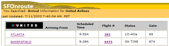
Flight Info (SFOnroute)

– Organized by Airlines (very good idea since the airlines connecting at an airport is limited – not all airlines will fly to each airport. For example, in Pudong Airport, the major airline from U.S. are United (UA858…) and Northwest Airlines (NW58…). That make is easy to locate a flight.

– Orgnized by Arrival and Departure – Well, it may be neccessary for SFO. For PVG, it is easier since there is no big difference in route for arrival and departure.

– Example: UA Arrival

Techincal details

http://www.flysfo.com/sfonroute/sfonroute_inter.asp?airline=ua&choose=1

where parameters are like this:

airline
choose

Comment: SFO is doing perfect on the flight information section.

SEA – Seattle Airport

Flight Info

The flight information section of Seattle Airport’s website is terriable. It does not provide a tracker at the first page of the site. Instead, it listed the headlines for the majority portion of the homepage real estate. It is stupid. How many people visiting a airport website to find out that the govenment just approved $159 million for it, or the golf tournament?

screen-sea.airport.PNG

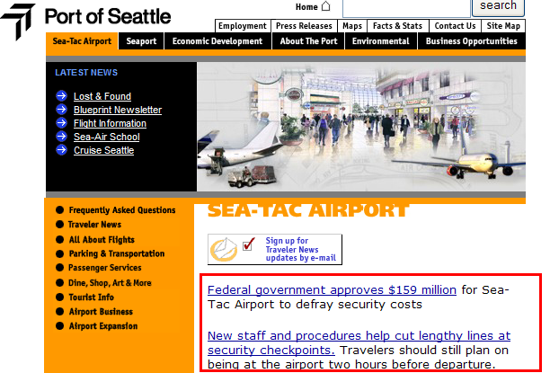
The page under Flight Information does not provide flight information too. Instead, it is a index page again. When I click “Track a Flight“, I was so disappointed to see another website is loaded in a new window.

Comment: An airport website without good flight information is useless and less attractive. P.S. the tab design of the page is bad. Nothing on the tab seems useful for me.

Singapore Changi Airport

Flight tracking

It is good that it offers a flight tracking button screen-changi.airport.flight.info-icon.gif at the homepage, but the problem is, the destination page does not provide the flight information right there. The visitor need to choose from lots of options – Airlines, Freight, Passenger, SMS, Voice, WAP, PDA. I guess 90% of people will choose Airlines or Passengers (confused too between these two terms), why not list them directly there.

It is a very nice idea to provide SMS and PDA functions there – it is not expensive to develop.

WAP Flight Infomation

The highlight in Changi Airport Webiste is the WAP flight information. It works very well. Using my Alcatel OT715 GPRS mobile, I can easily get a list of flight from Shanghai to Changi – even more easier than on the website. (WAP URL: http://wap.changiairport.com.sg – note: this URL cannot be read from a browser)

Again, the navigation bar seems to be easily ignored this time.

Overall rating: Average. WAP Flight Information is the highlight.

NRT – Tokyo Narita Airport

Flight Information

Good. It has the flight information lookup box at the top-left corner. Unlike SFO airport, it provide more function of lookup flight by departure city or arrival city. This is useful but confusing – the relationship between the two search box is confusing.

As a useful website, it may not be neccessary to cover all the flights. For example, the majority of destination from Shanghai are either SFO or Vancouver, CA. It may not be neccessary to list all the possible airport, if resource does not permit to do so.

The result of the flight information of NRT airport website is among the best I have ever seen – more clear and seems reliable. I love the idea to mark the shared code flights in the table.

All Flights

NRT provide the function of Today’s All Flight. Accually, this is more useful than the search.

NRT is a busy airport so the display of the result used segmented table, which is a good way to increase display performance – the big table does not need to completely loaded. From this small tip, I know the designer of the website much be very experienced.

Overall rating: Wonderful job!

HKG – Hong Kong Airport

Hong Kong Airport does not provide a short cut for checking Flight Information on its homepage, however, finding your way to the right page is not difficult. The Flight Information section is listed at the left top corner of the main content. After clicking “Passenger Arrival”, to my surprise, all the 250 flights of the day were listed in a large good-looking table. The search criteria serves as filter for the large data.

I love this design very much. When the information itself is simple, do NOT create complicated search engine for it. In this example, when the whole database contains only 250 recoreds for that day, why bother to hidden the result and only provide search interface? People’s brain and eyes are very well trained to seek for the right information on this page than the search tool.

Overall rating 4 out of 5 – very nice and handy, expect I don’t like the frame.

Other airports

In the Flight Information Section of this report, I covered three main flight – SFO, SEA, NRT and Singapore. For other airport, I may either add them later or just pause here.

To be continued….

In the next article of this World Airport Website Report, I will provide an indepth review of the airports on other functions, like To & From airport, Airport Layout, Terminals and Map….